New athletics logo a ‘no-go,’ survey says

By: Byron Hoskinson – News Editor
A survey conducted by the Dayton Business Journal to gauge the public’s receptiveness to the University of Dayton athletics logo found, in a sample size of 850, near universal dissatisfaction with the image.
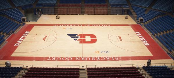
UD announced the new logo’s adoption last Friday in a press release that coincided with the launch of microsite daytontrueteam.com, which contains a gallery depicting designs for the men’s basketball uniforms and an aerial photograph of Blackburn Court with the new logo painted on it.
UD collaborated with branding agency 160over90 to create the logo, and Nike provided creative consultation for the uniforms, according to the release.
The positive assessments of the logo were selected the least among the survey’s options, with 2% choosing “love” and 6% “like.” There were as many “unsure” as total positive responses; negative replies made up the bulk of the data, with 85% of polled opinion responding that they either “don’t like” or “hate” the new logo.
Just shy of a majority at 47%, the most negative response proved the most popular.
The survey was posted on business news outlet DBJ, and is the latest media platform being used by the Flyer fan base to direct their input to the administration.
Strong reactions to the unveiling have also driven the formation of petitioning groups on Facebook and change.org, a website that assists groups and organizations in formalizing their approach to reform.
The new logo, images of the uniforms and refaced court were released slightly before 1 p.m. on Friday, July 19. Within minutes of their publication, students, fans and alumni had begun reacting to the logo’s reveal and within eight hours groups protesting the change had organized on various media platforms to appeal the university’s rebranding.
By that night, petition groups had been created to address diverse complaints, ranging from the disappearance of the “U” and resemblance of the new wing to a “V” to concerns that UD used the Philadelphia-based 160over90 at the expense of local talent and suspicions that input from students and alumni was only superficially sought.
One petition group from change.org has gathered over 2,100 signatures in its pursuit to “bring back the “’U’!” and provides several alternatives to the 160over90 logo, including one that keeps the winged, sleek look and both initials (credited to UD alumnus Nicholas Earl Schmidt).
A Facebook community voicing similar grievances has garnered over 1,500 likes. The community, “We are UD, not VD,” considers the “new logo to be unrecognizable, inappropriate, and untrue to the spirit of the University” and asks members to regard the page as a place to “express their views on the matter.”
“UD alums against the new athletics logo,” a Facebook group of 700, was also founded in response to the rebranding.
According to the news release, UD and 160over90 sought to “create…a design that embodies the University’s history and its vision for the future” while serving a recruitment function by attracting “attention from high-quality student-athletes.”
UD athletic director and vice president Tim Wabler called the new image “an investment in our athletic program’s future.”
No financial information has yet been released and athletics communication was unable to provide estimates.
Krystal Warren, assistant director of athletics communication, said the UD, 160over90 and Nike collaboration had been going on for 18 months at the time of the projects unveiling.
Erin Degiralomo ‘09, wrote to Flyer News this week in an editorial about her take on the logo. She described her view as “threefold.” She said she was “surprised that a school which places so much emphasis on community did not look within its own community to update the University’s branding…rather…UD leadership chose to hire a Philadelphia-based design company, for reasons which aren’t readily apparent.”
Warren also said the university had first begun contracting 160over90 in 2007, when their only office location was in Philadelphia.
“Between current students, staff and alumni, the UD community is rich in designers,” said Degiralomo, “as is the greater Dayton area, and even Ohio.”
Kaitlin Meme ‘14, works as a graphic designer at Akron-based 427 Design. Meme said, as a designer, she struggles “to see the intention behind the overall idea of this logo.”
Wabler said one reason UD dropped its vowel is because it is just one of a number of UDs—Detroit, Denver, Delaware—around the country. Meme said regardless, people will probably have difficulty adapting to it because it competes with the prior conception of “UD.”
“If the blue is supposed to be a wing, I get it,” she said. “But when you divide two blocky shapes by white lines and put them in equally bold colors, and when everyone knows the school by “UD,” the mind wants to make that odd blue thing into a letter also, and can only come up with “V.”
In her article, Degiralomo quotes her husband as saying “I went to UD, not just…D.”
“Most troubling,” concludes Degiralomo, “is the lack of communication regarding the rebrand. As a donating alumni, I was very disappointed to have to learn of Dayton’s new brand through a press release and press conference, and even more upset when I saw the final product.”
“I actually received an email this morning telling me I won a free T-shirt with [the new logo] on it,” said Cathy Clark, ’77. “I respectfully declined.”
Follow @FlyerNews and @FlyerNewsSports for further updates.